CI/BI
The following are the introduction of HCN's corporate identity and brand identity.
CI
BRAND IDENTITY
HCN is a subsidiary of the Hyundai Department Store Group and it aims to help consumers to get a more valuable and rich life by sincerely implementing the communication & network which should be conducted in the broadcasting/telecommunication convergence environment.
Symbol & Logo Type
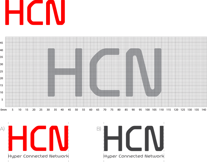
Color System
Scarlet Red(Pantone 1795C)
C0 M100 Y100 K0 / R255 G0 B0
C0 M100 Y100 K0 / R255 G0 B0
Charcocal Gray(Pantone 433C)
C0 M0 Y0 K90 / R65 G64 B66
C0 M0 Y0 K90 / R65 G64 B66
BI
BRAND IDENTITY
Hy is the digital convergence brand for HCN which is the multiple system operation (MSO) under the Hyundai Department Store Group.
Hy mainly through its logo showing the shapes of rectangles joined together expresses its representative service media: TV and monitor and the identity of the interactive digital convergence media through them. Hy symbolizes the hyper, media, and hybrid digital, thereby showing reliability and advancement. In addition, through the additional meanings such as Hi and High, it also shows friendliness and high quality.
Hy mainly through its logo showing the shapes of rectangles joined together expresses its representative service media: TV and monitor and the identity of the interactive digital convergence media through them. Hy symbolizes the hyper, media, and hybrid digital, thereby showing reliability and advancement. In addition, through the additional meanings such as Hi and High, it also shows friendliness and high quality.
Symbol & Logo Type

Signature